728x90
[목표]
: 너비 600px이 넘어가면 좌우로 나란히 배치한다. 600px 아래일 경우 위 아래로 배치한다.
방법1 )
<!DOCTYPE html>
<html lang="en">
<head>
    <meta charset="UTF-8">
    <meta name="viewport" content="width=device-width, initial-scale=1.0">
    <title>Document</title>
    <link rel="stylesheet" href="default.css">
</head>
<body>
    <div class="flex-container">
        <div class="flex-item">HOME</div>
        <div class="flex-item">ITEM</div>
        <div class="flex-item">CUSTOM</div>
    </div>
</body>
<style>
    .flex-container {
        display: flex;
        flex-direction: column;
    }
    @media (min-width: 600px) {
        .flex-container {
            flex-direction: row;
        }
        .flex-item {
            flex: 1;
        }
    }
</style>
</html>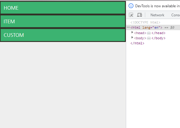

너비가 600px일 경우
꼬챙이를 위아래로 꽃았던 것을
좌우로 꽃는 걸로 바꾼다.

방법 2)
기본으로는 flex 하지 않고 있다가
600px 아래로 내려갈 때는 flex 적용시킨다.
<!DOCTYPE html>
<html lang="en">
<head>
    <meta charset="UTF-8">
    <meta name="viewport" content="width=device-width, initial-scale=1.0">
    <title>Document</title>
    <link rel="stylesheet" href="default.css">
</head>
<body>
    <div class="flex-container">
        <div class="flex-item">HOME</div>
        <div class="flex-item">ITEM</div>
        <div class="flex-item">CUSTOM</div>
    </div>
</body>
<style>
    @media (min-width: 600px) {
        .flex-container {
            display: flex;
        }
        .flex-item {
            flex: 1;
        }
    }
</style>
</html>
'CSS' 카테고리의 다른 글
| css 초보 실습 - 헤더에 있는 회원가입,로그인 버튼 정렬 실습 (0) | 2023.09.02 |
|---|---|
| flex를 이용한 정렬(justify-content, align-items, align-content) (0) | 2023.09.02 |

